Branding
The branding for Terracotta Palace is largely based around the terracotta from their name with that being the predominant colour of the brand and also influencing the dirt and clay textures used along with the loose paint style of the palace. Using a terracotta colour for a band called Terracotta Palace makes it easy for the brand to not only be recognised by text or graphic icons and logos but also by colour and texture.
Album Cover
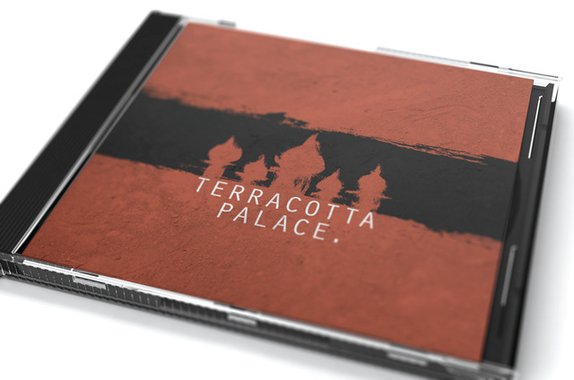
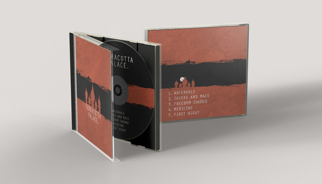
The album cover is predominantly a terracotta colour with a thick black brush stroke through the centre which creates a black band which works as the night sky behind the Terracotta Palace silhouette. The back of the album cover again features the black stroke across the terracotta base this time with a smaller version of the palace silhouette with a moon in the background and the five song titles listed below. The CD design is basically the reverse of the covers having a black base with a terracotta stroke through the middle, the band title is listed above and the song titles below. The reverse version from the covers allows the CD to look different from the cover yet remain easily recognisable as part of it due to the stroke, colours, texture and text.
Shirts
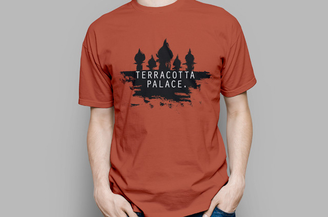
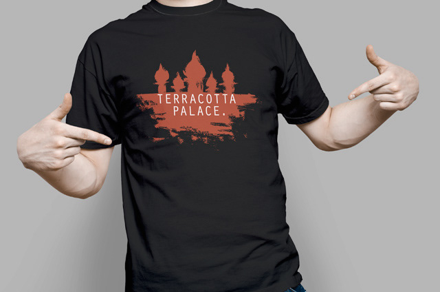
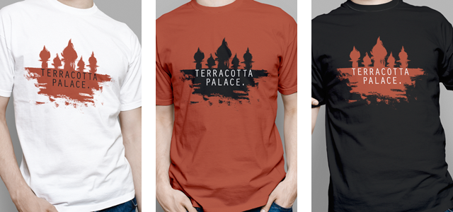
The T-Shirts feature a variation of Terracotta Palace icon with brush strokes added to the bottom of the silhouette to give the palace some context because the large horizontal stroke has not been used due to requiring the more expensive all over printing. The extra strokes provide a base for the palace or can also be viewed as a reflection. The shirts have three variations with the black and white ones both featuring a terracotta version of the icon with the third shirt being a terracotta one this time with the palace silhouette in black.

Terracotta Palace
You can find Terracotta Palace on the following links.
http://www.facebook.com/terracotta.palace.aus
http://www.facebook.com/terracotta.palace.aus