Description:
Michael Hendrick Carpentry is the solo contractor work of Michael Hendrick. Michael splits his time between being hired by other building companies to work for them as a contractor on particular jobs and providing work under his own individual contracting business.
As a contractor for other companies, Michael was generally part of teams building houses or working on house repairs. His desire for his solo work was to do more personal, smaller scale jobs for clients, such as house extensions, one-off rooms or sheds, and perhaps most commonly, decking and pergolas.
As a contractor for other companies, Michael was generally part of teams building houses or working on house repairs. His desire for his solo work was to do more personal, smaller scale jobs for clients, such as house extensions, one-off rooms or sheds, and perhaps most commonly, decking and pergolas.
Brief:
Michael decided to take a step back from being hired as a contractor by other building companies to do more individual contracting work for his own clients. As he transitioned to doing more independent work, there was an increased need for a personal brand when approaching new clients, as well as a valuable asset when building companies hired him as a contractor for their projects.
Known for his meticulous craftsmanship, Michael’s reputation for quality work precedes him. However, he recognised the importance of creating a brand to increase his client base and appear more professional as a solo operator.
Known for his meticulous craftsmanship, Michael’s reputation for quality work precedes him. However, he recognised the importance of creating a brand to increase his client base and appear more professional as a solo operator.
Solution:
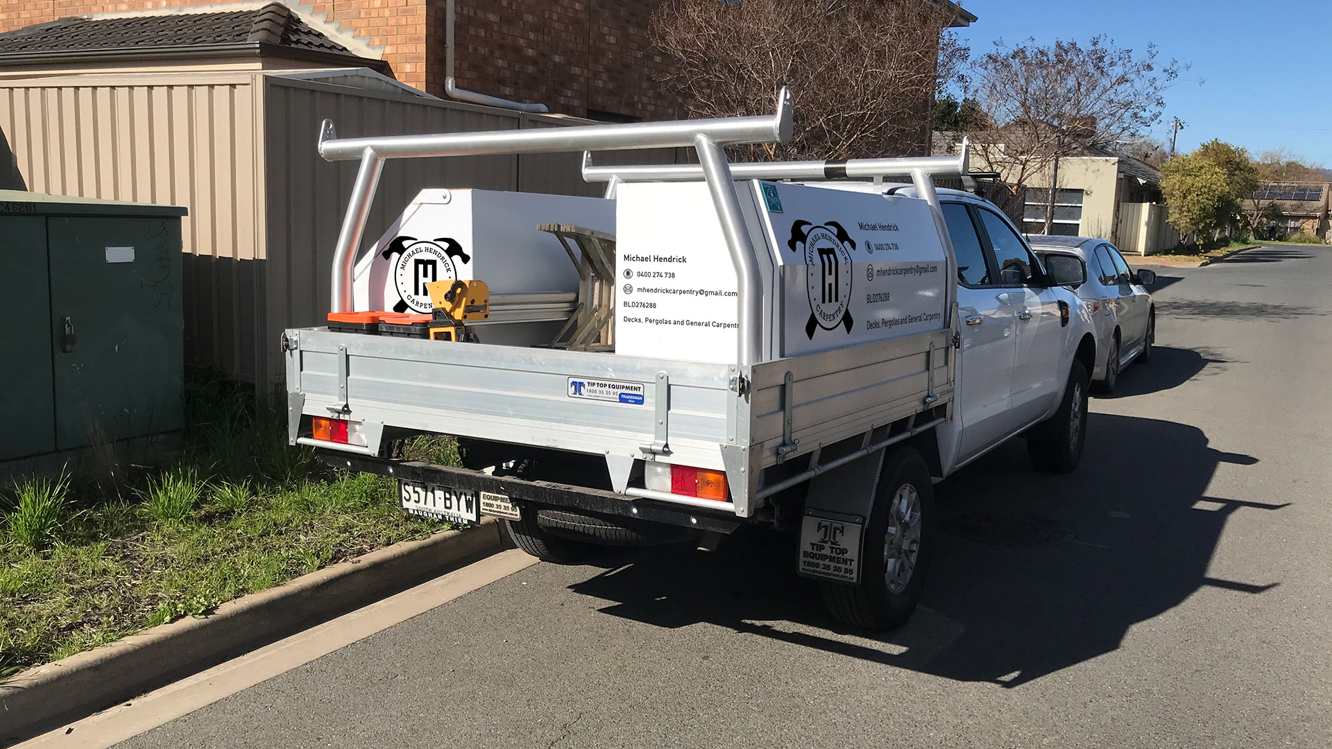
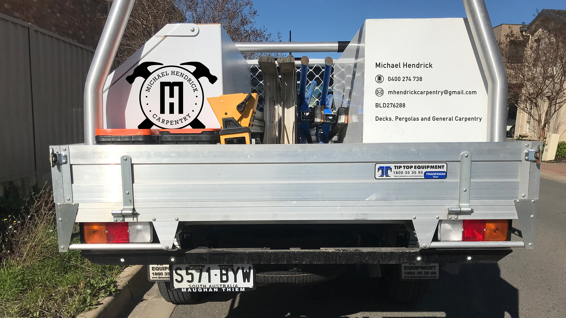
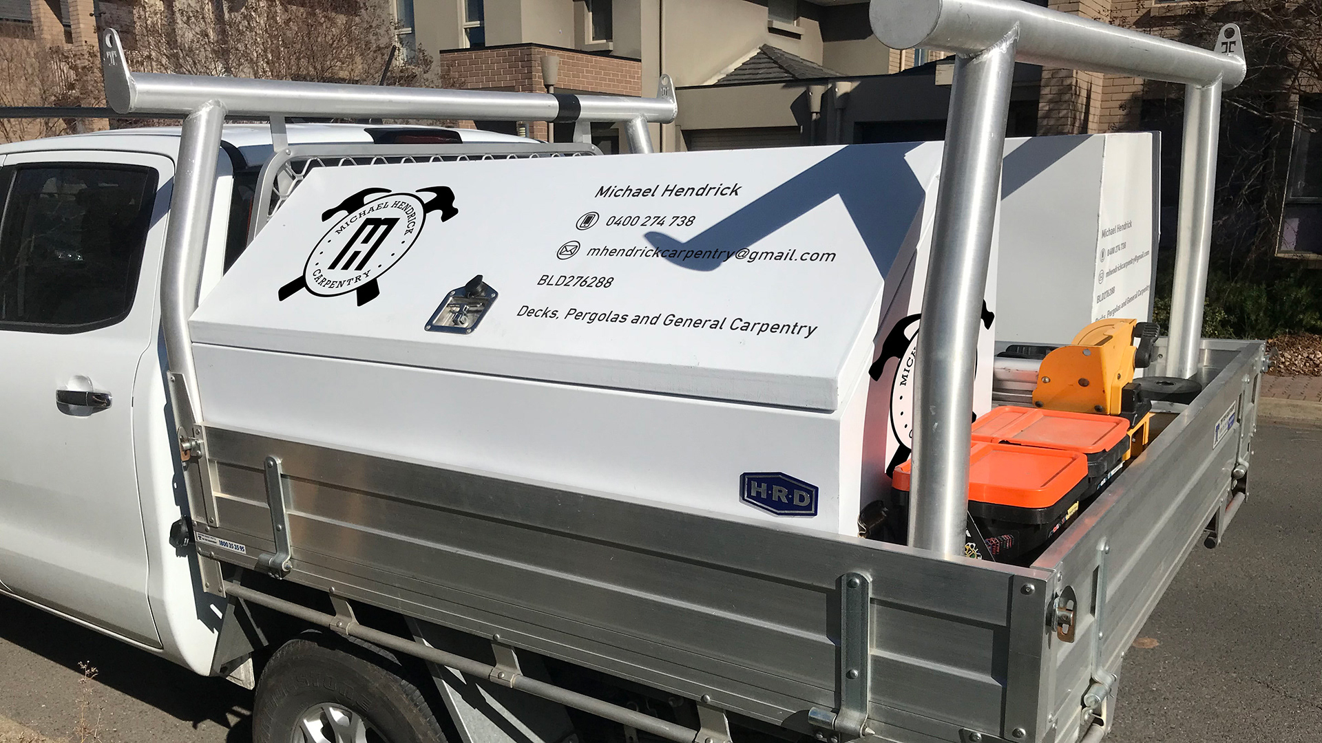
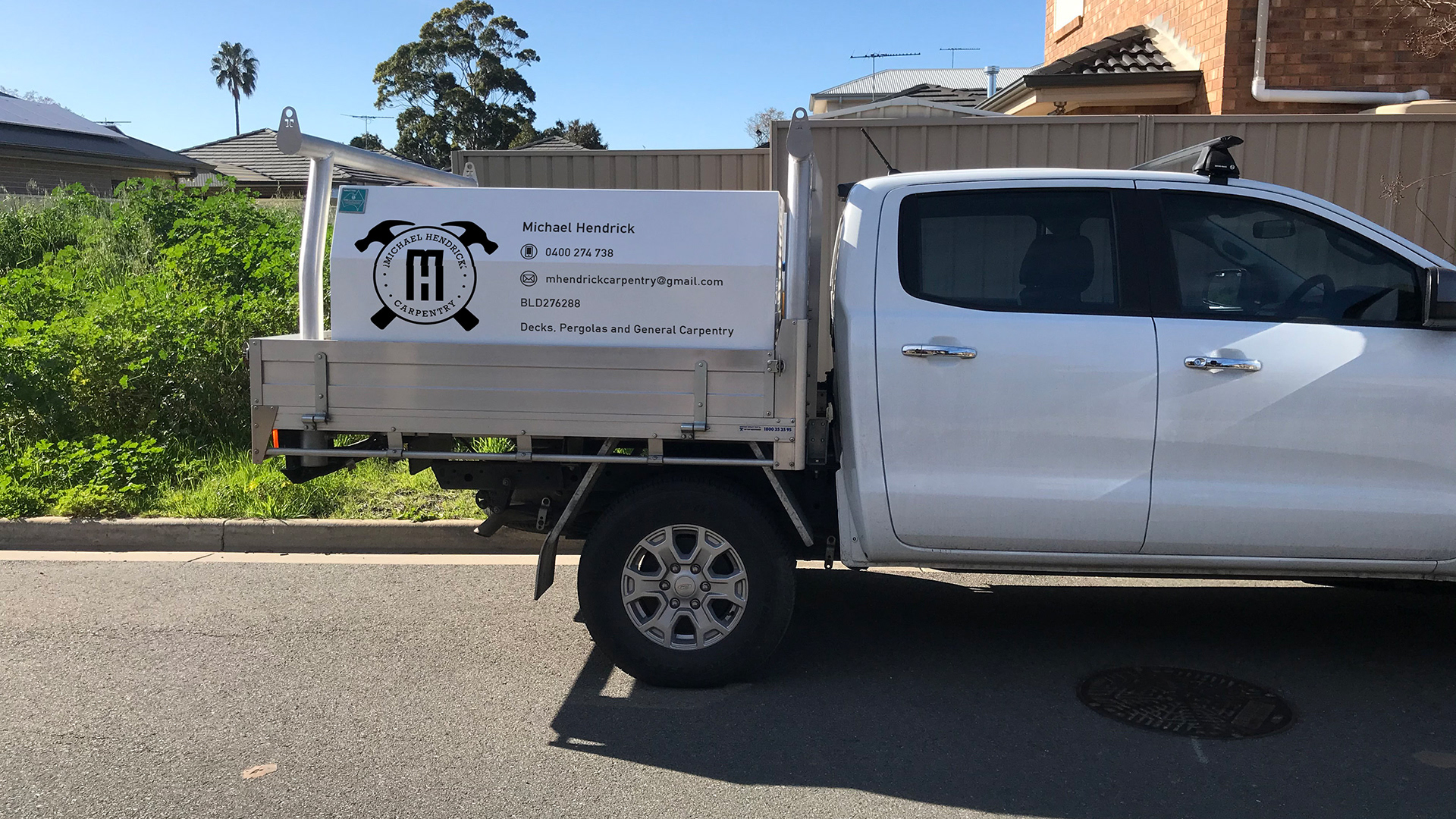
The logo itself features Michael’s initials (M and H) in the center. The characters are intended to look long and rectangular, much like the beams of wood that Michael uses in his construction, particularly decking.
There are two hammer graphics in the background. The hammers are an iconic symbol in carpentry, and the use of two of them, rather than one and another tool, is to keep the logo simple and symmetrical, emphasizing that Michael’s work is tidy and precise.
Michael’s name is listed on top, making it feel more personal, with “carpentry” listed at the bottom. The words are separated by three dots on each side, which are intended to look like nails that have been hammered in.
The branding has been implemented in black and white, maintaining a clean and minimalist aesthetic, while also keeping production costs down.


